 Hopefully you're seeing a fancy new logo up there at the top of the page and down a bit along the right-hand side of the link bar. Isn't it pretty? I think so (though I probably need to increase the resolution a bit).
When I first started thinking about getting a professionally done logo to replace my own poorly-crafted one, for a variety of reasons the first name that came to mind was that of Brandon Reese. I knew there was a lot of talent in the kids music field -- Billy Kelly, for example, or Kevin Kameraad, not to mention musicians with a nice eye for design, such as Frances England. But Brandon was definitely my first choice.
You're probably familiar with Reese's work -- he's designed album covers for Lunch Money and The Jellydots, not to mention a bunch of games and other stuff for eeBoo. (And I interviewed him a little more than a year ago.)
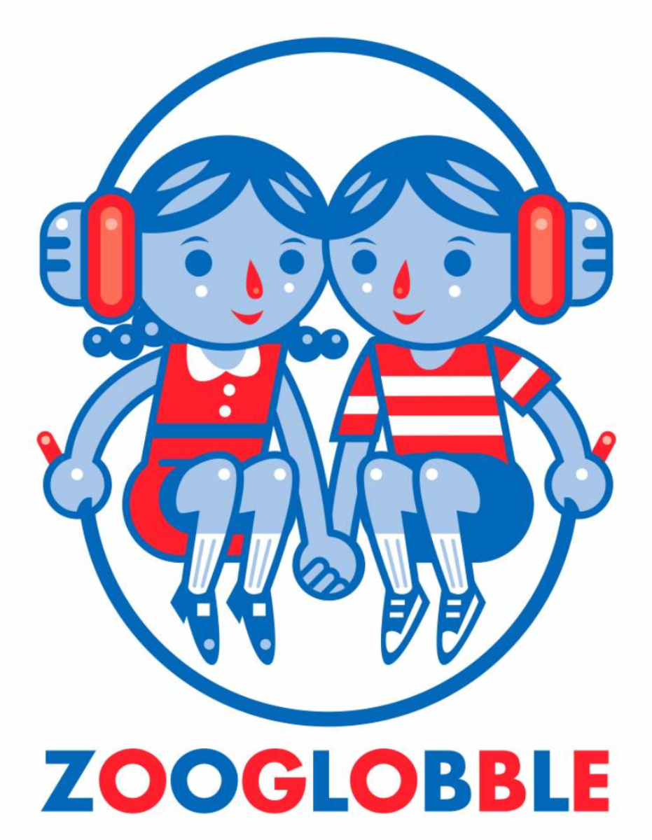
He has a sense of whimsy and play along with a strong design sense, two things I wanted to convey with this new logo, and I think he nailed it. That logo on the right is what I like to think of as the main logo, the one that if I were to sell all sorts of stuff would be plastered all over it. (Anybody need a men's organic t-shirt?) But it's got a very portrait orientation and sometimes I'm all landscape-y, so Reese designed a second logo that incorporated part of that first logo...

Anyway, I'm very happy with the logo. Thanks to Brandon for taking some pretty vague design concepts and turning them into something with a virtually no fuss. If you want to learn a little bit more about the design process for this logo and Reese's next projects, read on...
Zooglobble: What particular design challenges did you face with designing this logo?
Brandon Reese: I think my main challenge was to make sure the logo read well in small and larger formats. I also wanted to keep the colors to a minimum to keep costs down when printing business cards, letterheads, t-shirts, etc.
There were a few things that you said you wanted the logo to convey. You wanted to show some sort of action and stay away from kids idly just listening to music. You also wanted me to think about Zooglobble's motto "kids music worth sharing".
It's funny. When I was just about to send off my first round of sketches to you, the jumprope image came to me. I quickly doodled it and added it to the email. That was the sketch that ultimately became the logo.
Is there anything in the logo you're particularly pleased with?
I really dig that the headphones and jumprope create a semicircle. I'm big on symmetry. It keeps my OCD brain happy.
What other projects are you currently working on?
Currently, I'm working on a robot-themed colored pencil set and sketchbook cover for eeBoo. Oh, and just last week I met with Molly Ledford from Lunch Money to discuss the visual direction for their next album. It's going to be sweet!... mmmmm... donuts...
Here is a donut- O
Here is a donut hole- •
I ate some of this donut- C
Sorry, only crumbs left- ...


